Alerts
Provide contextual feedback messages for typical user actions with the handful of available and flexible alert messages.
Examples of Alert without close button.
Alerts are available for any length of text, as well as an optional dismiss button.Alerts are available in five different variants (primary,success,danger,warning,secondary) For proper styling, use one of the five required contextual classes (e.g., .success-alert).
Example of Alert with close button.
Alerts can have a button to dismiss the alert.
JavaScript code
Avatars
Avatars are used to show profile picture of user on edit-profile page,user settings, user details.
Examples of Image Avatar.
Avatars with image are available in four different variants based on size large, medium, small, extra-small (e.g., .avatar-lg).


Examples of Text Avatar.
Avatars with text are available in four different variants based on size large, medium, small, extra-small. Use avatar-text class here. (e.g., .avatar-lg).
Badges
Badges are used to display information like notification count or online / offline status and can have different shapes like with icons or pill shape
Examples of Status Badge.
Badges on avatars can be used to show information if the user is online or offline.
Examples of Notification Badge.
Badges can also be used to display number of notification or number of items in cart.
Cards
A card is a flexible and extensible content container. It includes options for headers and footers, a wide variety of content, contextual background colors, and powerful display options.
Example of Horizontal card.
Primary button can also have multiple variants depending upon the action it is being used for.
 New Arrival
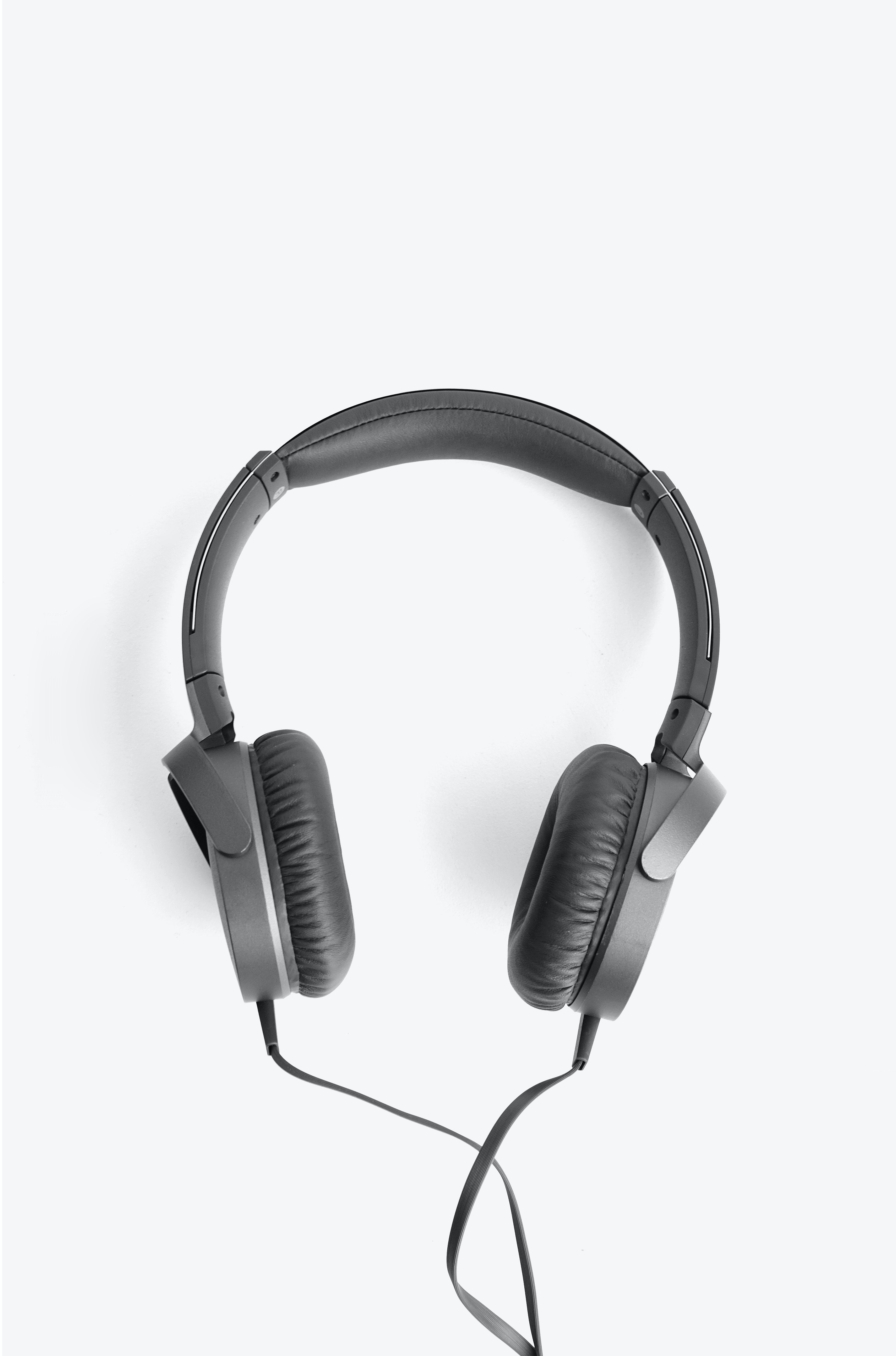
ONEAR 100 HEADPHONES BLACK
Advance Noise Canceling, Ambient Sound, Listening Optimizer
Referende Id:7837A7
These simple and comfortable earphones remain stable in your ear, so you can enjoy your music while jogging, without worrying about your earphones.
Examples of Vertical card.
Below are 3 variations of vertical card. Card with badge, card with dismiss button, card with only text.
New Arrival
ONEAR 100 HEADPHONES BLACK
Advance Noise Canceling, Ambient Sound, Listening Optimizer
Referende Id:7837A7
Rs.1890 Rs.2099 10%
New Arrival
ONEAR 100 HEADPHONES BLACK
Advance Noise Canceling, Ambient Sound, Listening Optimizer
Referende Id:7837A7
Rs.1890 Rs.2099 10%
ONEAR 100 HEADPHONES BLACK
Advance Noise Canceling, Ambient Sound, Listening Optimizer
Referende Id:7837A7
Rs.1890 Rs.2099 10%
Example of Vertical card with overlay text.
To overlay text or any other component ,we need to wrap overlay container(div which needs to be overlaid) and the overlaying component(which overlays) in a single div
New Arrival
ONEAR 100 HEADPHONES BLACK
Advance Noise Canceling, Ambient Sound, Listening Optimizer
Referende Id:7837A7
Rs.1890 Rs.2099 10%
Inputs and Form Component
Example of Active fields.
Add required-field class with label tag to show * with the label, if the corresponding field is required and required attribute to the corresponding input field.
Example of Disabled and Read only fields.
Add the readonly boolean attribute on an input to prevent modification of the input’s value. Read-only inputs appear lighter (just like disabled inputs), but retain the standard cursor.
Add disabled-field class to style it like a disabled field and disabled boolean attribute to the corresponding input field.
Example of Form validaton.
Below is an example of form validation, errors are shown when validatons are not met.
Images
Example of Responsive image
Add responsive-img to fit the image according to its parent's width
Example of Round image
Add circular-img to get a circular image
Rating
Rating component can be used as both readonly or in a form to get user experience.
Example of Readonly rating
Example of Readonly rating
Please rate us by clicking on the stars below
JavaScript code
Typography
Example of Heading text
Directly h1,h2,h3,h4,h5,h6 tags could be used or class h1,h2,h3,h4,h5,h6 can be applied to get the required font size
This is headding - H1
This is headding - H2
This is headding - H3
This is headding - H4
This is headding - H5
This is headding - H6
Example of Body text
Any of the classes from body-typo-xs, body-typo-md, body-typo-lg, typo-lg can be applied to p tag to get required styles.
This is body text.Body-typography-medium
This is body text.Body-typography-medium
This is body text.Body-typography-small
This is body text.Body-typography-extra small
Example of some other text styles
Check the classes from code below to ger desired results.
Body text with bold weight - 700
Body text with bold weight - 500
Body text with bold weight - 300
Body text with strike through
Body text with primary color
Body text with secondary color
Lists
Lists are very handy and can be used for navigation bar, stacked notifications ,articles etc
Example of Unordered list
Add classes according to the type of bullet required . Check HTML code below.
- Default list style item1
- Default list style item2
- Default list style item3
- Square list style item1
- Square list style item2
- Square list style item3
- Circle list style item1
- Circle list style item2
- Circle list style item3
Example of Ordered list
Add classes according to the type of bullet required . Check HTML code below.
- Numbered list style item1
- Numbered list style item2
- Numbered list style item3
- Lowercase alphabet list style item1
- Lowercase alphabet list style item2
- Lowercase alphabet list style item3
- Uppercase alphabet list style item1
- Uppercase alphabet list style item2
- Uppercase alphabet list style item3
- Lowercase roman style item1
- Lowercase roman list style item2
- Lowercase roman list style item3
- Uppercase roman list style item1
- Uppercase roman list style item2
- Uppercase roman list style item3
Example of Stacked notification
This is a stacked list of notifications. Any content can be added to li tag.
-
Profile Visitor
30 people visited your profile while you were away!
-
Profile Visitor
30 people visited your profile while you were away!
-
Profile Visitor
30 people visited your profile while you were away!
-
Profile Visitor
30 people visited your profile while you were away!
Modal
Modals can be used to perform certail actions without interrupting with main flow of the web application.It could be used to perform a single action or a series of action.
Live Demo
Click the button below to open the modal .Modal can be closed by either clicking on close button or clicking outside the modal.Check the JavaScript code below to achieve this functionality.
JavaScript code
Toast
Toasts are used to show feedback message to end user. This component could alos be used as a snackbar by introducing an action button.
Live Demo
Click the button below to show the toast. Check the JavaScript code below to achieve this functionality.
JavaScript Code
Grid
Grids are very useful while designing the layout of the web application under different screen sizes.
Example of 2 column grid layout
For screen sizes greater than 480px items are arranged in a grid of 2 and below 480px, items get stacked
Limited Offer
Grab your ONEAR 100 HEADPHONES NOW AT Rs.1099
Example of 3 column grid layout
For screen sizes greater than 480px items are arranged in a grid of 3 and below 480px, items get stacked
Limited Offer
Grab your ONEAR 100 HEADPHONES NOW AT Rs.1099
Limited Offer
Grab your ONEAR 100 HEADPHONES NOW AT Rs.1099
Limited Offer
Grab your ONEAR 100 HEADPHONES NOW AT Rs.1099